7DRL Devlog
I’m making a game for 7DRL 2024! I last attempted this challenge in 2018, and I didn’t finish my game. This time, it’s happening. Dundledorf’s Castle (DC) is a survival-oriented roguelike with horror themes, programmed in the TIC-80 fantasy computer.
Prior Art
My two primary sources of inspiration for DC are the games Haunted House, and 868-HACK, or the work of Michael Brough more broadly.
Haunted House is an Atari 2600 game released in 1982. It’s a simple exploration game where you navigate the floors of a dark mansion, avoiding enemies and collecting pieces of an amulet. Your character is a simple pair of eyes, floating in a dark void. You can light a match to create a small light source around your player.
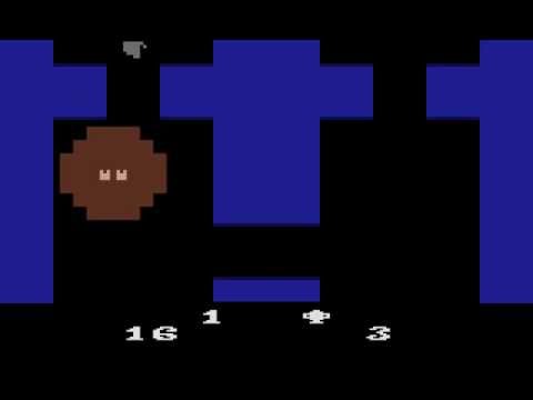
Haunted House (1982)
So the spark of my idea was a roguelike with limited vision, and a light source with limited fuel that must be carefully managed. If you run out of fuel, you’re trapped in the darkness.
The game is “Broughlike” in style, using a smaller map size (8x8) and a limited set of mechanics. The game is not progression- or build-oriented; most items are consumable, and you have to continuously manage your limited inventory.
Mechanics
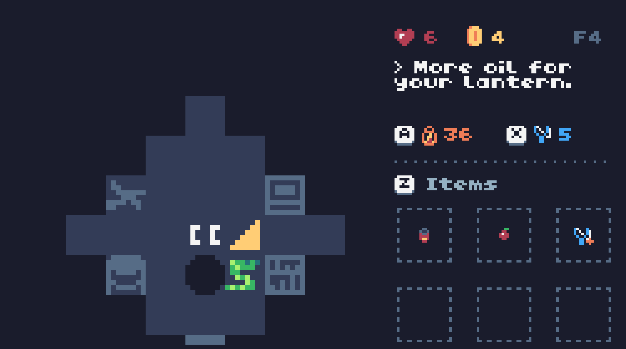
Here are the game’s core mechanics:
- The tower is dark, but you have a lantern that can light the immediate area around you.
- The lantern has limited fuel that depletes every step you take. You have to find oil canisters to refill your lantern, or else you won’t be able to see.
- Bumping into enemies kills them, but they get in an attack against you as well.
- You have a slingshot with limited ammo that can dispatch enemies from a distance.
- You will find items in shops, in chests, and sometimes freely on the floor. Every item has consistent mechanics (no randomness), but you have to figure out what the item does yourself by using it.
- Your inventory space is very limited. You can carry some passive items that make the game easier, but you also need to carry a supply of health/oil pickups so you don’t die or run out of lantern fuel.
Balance
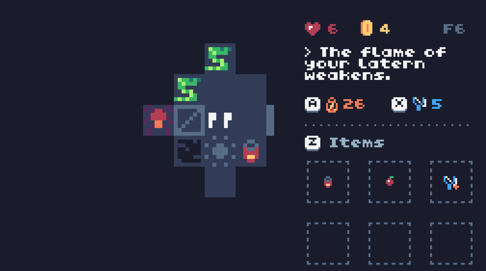
This is tricky! I’ve never made a game like this before, and balance is key. Here are some factors I considered:
- Lantern distance: initially, you could only see 2 spaces out, but this felt limiting, so I raised it to 3. There are a few items that enhance your navigational abilities.
- How quickly you accumulate money: every 5 floors you reach a shop to buy items. Money should not be terribly scarce, but you should have enough to buy something every 1 or 2 shops.
- Drop tables: each floor has two items. There are four types of consumables: health, lantern fuel, slingshot ammo, and money. Health and lantern fuel are the most important. You spend about 30–40 fuel per floor, so you need to find oil pretty regularly.
By midweek, I had something that felt like a playable game. On one particularly good run, I managed to climb 100 floors without much trouble. Granted, I made the game, so I have complete knowledge of the mechanics, but the difficulty curve wasn’t, well, curving enough!
I also wondered if a few of the items were too powerful. A big one is the shield, which blocks counterattacks. That is, if you and an enemy attack each other at the same time, they take damage, but you don’t. With proper timing you can avoid a lot of damage, and the shield doesn’t break.
Some items have infinite uses, and I’m wondering if more items need charges. Maybe the shield works 10 times before it breaks, or has a low random chance of breaking on each hit. However, even if an item has infinite uses, there’s one counterbalance: it takes up space. You only have 6 inventory slots, so if you’re carrying 2 or 3 really good power-ups, you have less space to stockpile fuel and health. As I’m writing this, I’m still ruminating on how this should work.
After some changes, here are the ways the difficulty scales from floor to floor:
- After 5F, an extra enemy spawns.
- Every 10F, a respawn is added. New enemies spawn in every 15 steps you take.
- Every 10F, full health and full ammo pickups appear slightly less frequently.
- Every 10F, ghosts appear slightly more frequently.
User Interface
Having a UX background, I greatly enjoy getting to put together the UI of a game. An important goal for me was for the game’s core mechanics and controls to be discoverable within the game itself; I don’t want people to have to read a separate blurb of text on the Itch page to learn how to play.
The interface for DC went through one major iteration based on feedback from a friend.
This is the original UI. It has this neat grid of 3x3 cells to represent all of your items, including the button prompts to access them. The big issue with this layout is it doesn’t clearly distinguish between your fixed equipment and your inventory slots. The top three cells—lantern, the slingshot, and your money—are fixed, while the bottom six cells are for items you pick up.
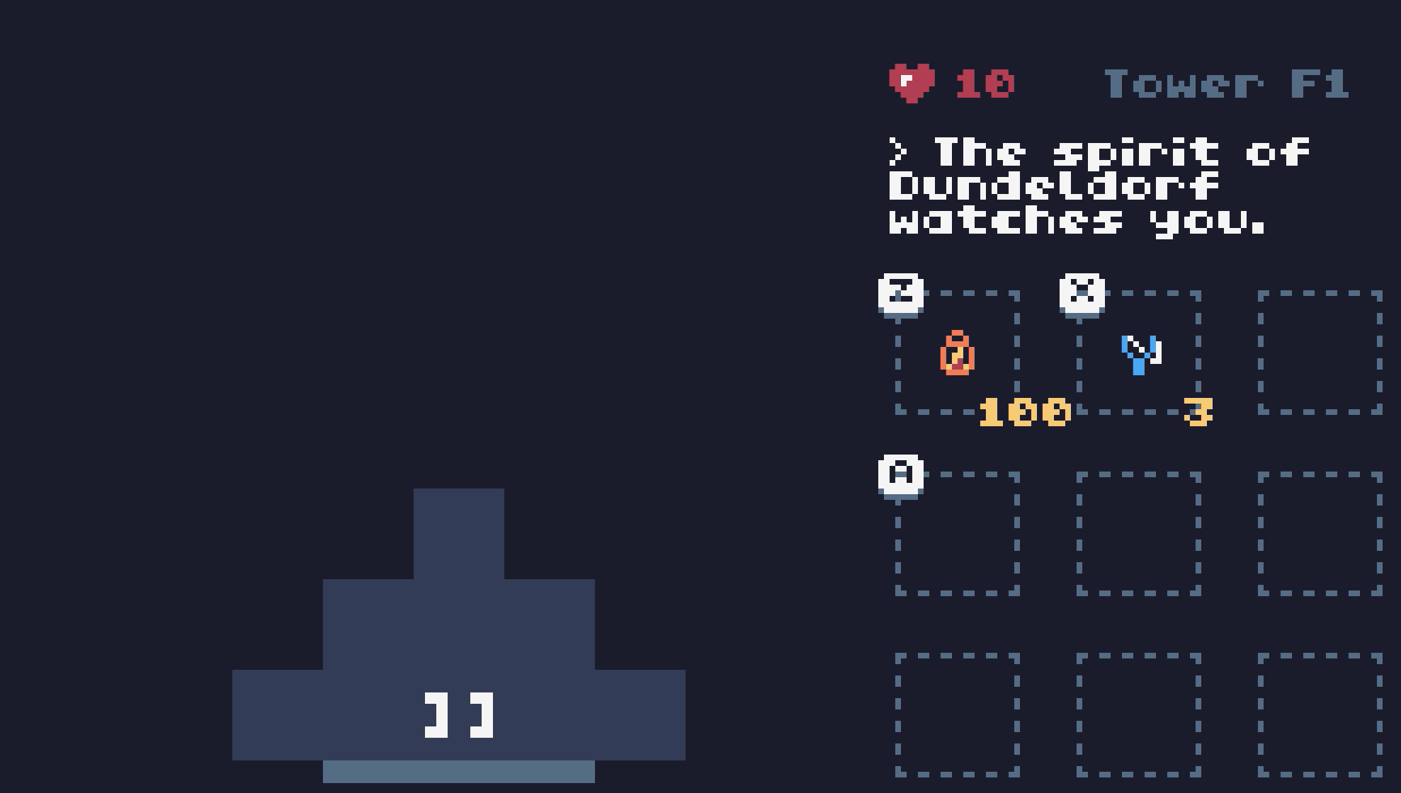
This screenshot is a little older, but the top-right slot eventually showed the number of coins you have.
You press the Z key (or A button) to open your inventory, and the same button to select an item to use. However, with this layout, it looks like the Z key only applies to the first item. My friend also thought that the items could be reassigned to different buttons, a la The Legend of Zelda, which is not the case.
Here’s the refined version. Those boxes are now used just for inventory slots, and how the keys/buttons map to each action is more clear. I was very happy with these changes!
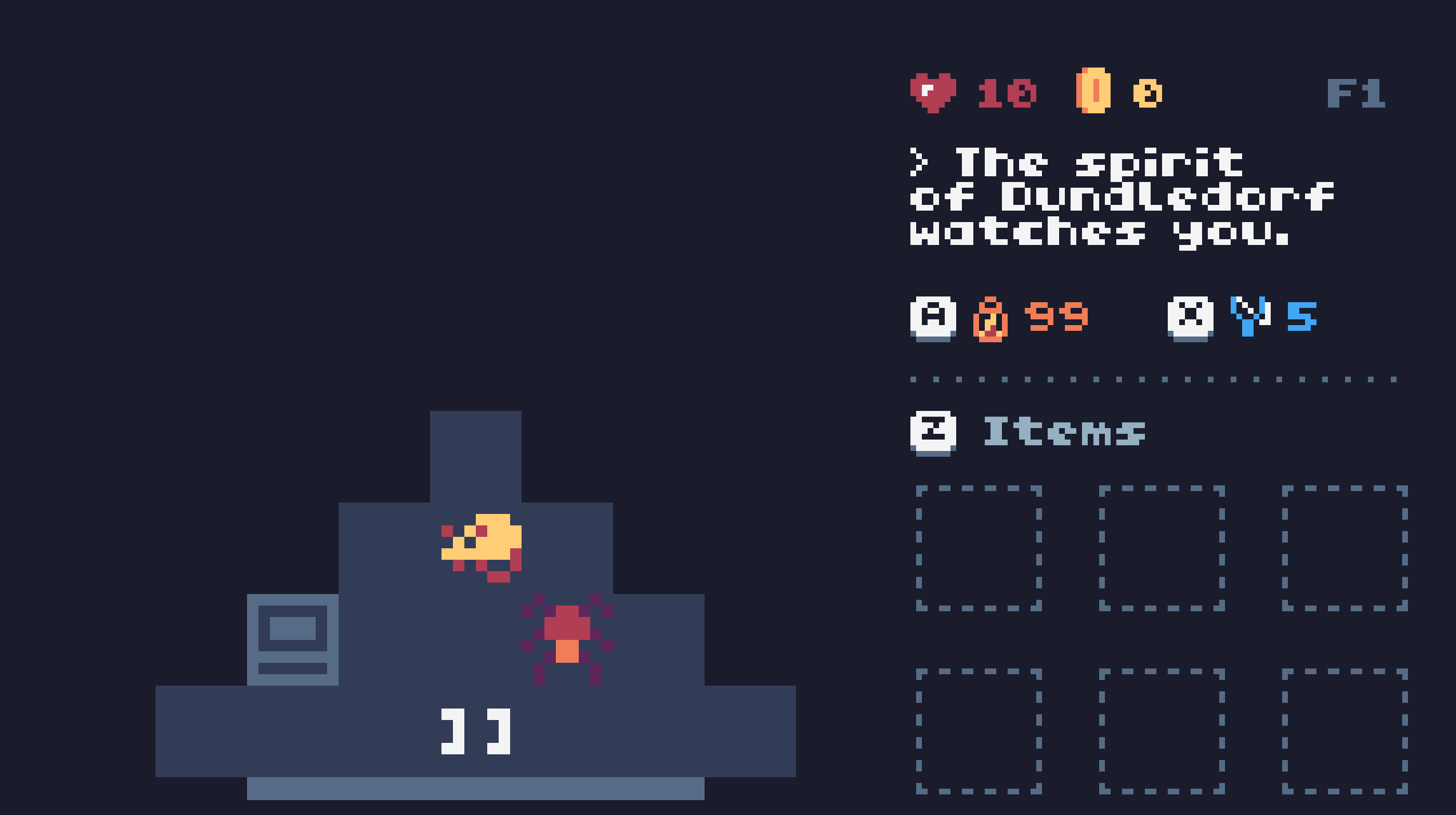
Another feature I wanted for the UI was support for both gamepad buttons and keyboard keys. Fantasy consoles like the TIC-80 or PICO-8 usually define their own controller layout with face buttons; the TIC-80 uses A/B/X/Y. In practice, however, people tend to play these games in web browsers, so you still need an affordance for keyboards.

The DC UI detects your input type and swaps out the button prompts accordingly. The code is very simple:
local using_keyboard = false

function TIC()
  if btnp() > 0 then
    using_keyboard = false
  end
  if keyp() then
    using_keyboard = true
  end
end
Scrapped Ideas
Originally I was thinking this game would be real-time, so closer to the actual design of Haunted House. However, it turns out I’m an inexperienced game developer, and making something turn-based in a week was going to be more straightforward. Also, it hews a lot closer to the spirit of 7DRL.
Another core mechanic I scrapped was related to equipment: I was thinking that your hands would be a slot you move items in and out of, so performing certain actions would have a tradeoff. For example, maybe you’d have to set down your lantern to fire a shot at a distant enemy, making the action a little more dangerous. Ultimately I couldn’t make the idea interesting enough to justify it. It also made a little less sense to me once I moved away from a real-time game towards a turn-based/grid-based game.
Some other mechanics I had written down but scrapped, mostly for time:
- The rat enemy can steal one of your items and run off with it.
- A slime enemy that leaves a damaging trail.
- An enemy that eats walls or items. (Because of the game’s limited vision, that idea feels less interesting given that the enemy might be off changing the map where you can’t see it.)
- Environmental interactions: maybe lamps you can turn on or off, or a light switch that reveals the entire room. The game has enough items that aid in navigation that this felt less necessary.
- Multiple rooms per floor. Again, I was thinking about Haunted House, where each floor of the mansion has multiple rooms, with stairs at the edges. I started looking into lock-and-key algorithms, ways to place mini puzzles on each floor, but it was too much for me to figure out in a short period of time. Also, I enjoy the momentum created by moving from floor to floor as quickly as you do.
Enter the Castle
I’m publishing this devlog on Friday, and most likely I’ll wrap things up for the project this evening. Thanks for reading!
Dundledorf's Castle
Ascend the castle tower. The spirit of Dundledorf watches you.
| Status | In development |
| Author | Geoff |
| Genre | Strategy |
| Tags | Horror, Roguelike, TIC-80, Turn-based |
| Languages | English |
Leave a comment
Log in with itch.io to leave a comment.